By The Agency Northwest Florida Beaches
Paint is the most affordable change you can make to a home and one of the most consequential. The wrong color in the wrong room doesn't just look off — it changes how the space feels, how light reads, and in a coastal market, how a home photographs. Whether you're preparing to list or simply want your home to feel more like itself, understanding how color actually behaves is worth the time before you pick up a brush.
Key Takeaways
- Light conditions on the Emerald Coast are distinct and affect how paint colors read inside the home
- Undertones matter more than the color itself; a "white" can read pink, green, or blue depending on light and surrounding finishes
- Different rooms have different functional needs that should guide color choices
- Cohesion across a floor plan matters as much as any individual room selection
How Coastal Light Changes Everything
Paint colors respond to the light in the room, and light on the Gulf Coast is not the same as light in Atlanta or Chicago. The intense brightness of a south-facing room in a Sandestin home will bleach out colors that would look rich elsewhere. Reflected light off water, white sand, and pool surfaces introduces a cool, blue-toned quality that shifts how warm colors register indoors.
Before committing to any color, test large swatches (at least 12 by 12 inches) on the actual wall and observe them at multiple times of day. What reads as a soft, warm white at 8 a.m. can look stark and cool by afternoon.
Before committing to any color, test large swatches (at least 12 by 12 inches) on the actual wall and observe them at multiple times of day. What reads as a soft, warm white at 8 a.m. can look stark and cool by afternoon.
What to Account for in a Coastal Home
- Southern and western exposures flood rooms with warm, intense light that can make saturated colors feel overwhelming; lean toward mid-toned, grounded hues in these spaces
- Northern exposures receive cooler, indirect light that flattens warm tones; warmer whites and soft greiges tend to perform better than crisp cool whites
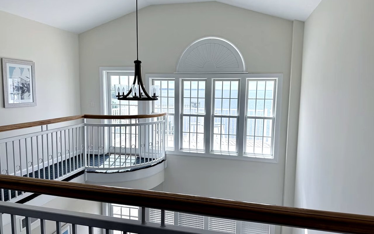
- Open-concept layouts with Gulf views or large glass doors introduce significant reflected light; colors tested in isolation will look different once that light fills the space
- Matte vs. satin finishes read differently under bright coastal light; matte reduces glare in sun-drenched rooms, while eggshell and satin hold up better in moderate-light spaces and clean more easily
Room-by-Room Color Logic
The function of a room should anchor the color decision. A palette that works beautifully in a primary bedroom will feel flat in a kitchen or home office. In vacation homes and second residences, this has a practical edge: colors that photograph well and feel immediately inviting matter more than in a primary home, because first impressions form fast.
Color Direction by Room Type
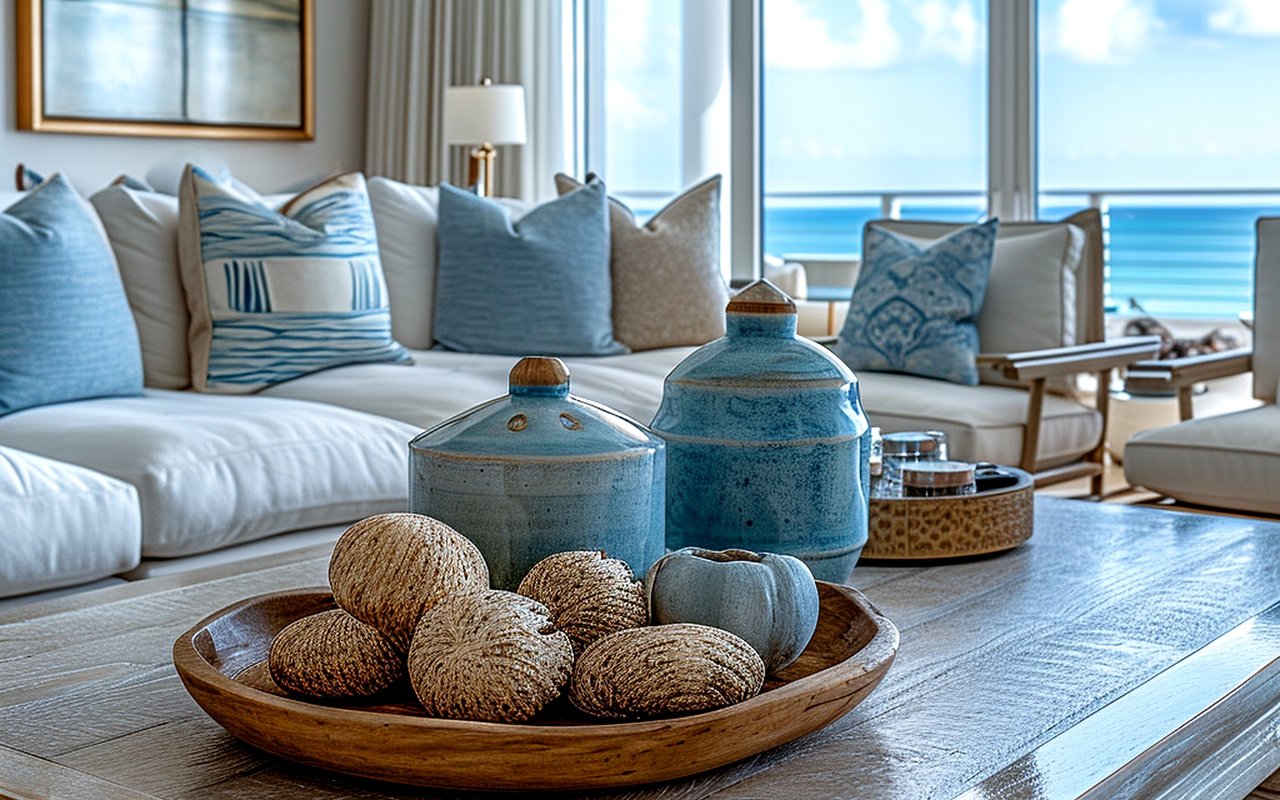
- Living and common areas: Warm neutrals with earthy undertones (soft taupes, warm greiges, dusty whites) create cohesion in open-concept spaces and complement the natural materials common in coastal luxury homes
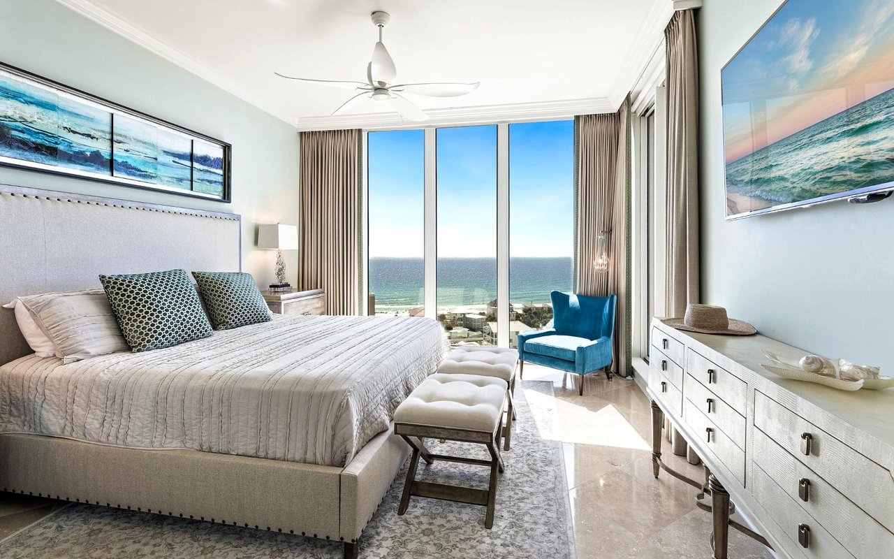
- Primary bedrooms: Muted, low-saturation tones in warm neutral, soft sage, or dusty blue-green ranges support rest without feeling flat and tend to appeal broadly to buyers
- Kitchens: Soft whites with warm undertones like SW Alabaster or BM White Dove perform consistently well; if you're incorporating color, keep it to an island or lower cabinets rather than all four walls
- Bathrooms: Lighter values make small bathrooms feel larger, but the undertone matters; a white with a green or purple cast against chrome fixtures can feel off; always test against your specific tile and hardware
- Home offices and flex spaces: Slightly deeper tones in warm greens, soft slate blues, or earthy clay make these rooms feel purposeful rather than generic
Undertones and Why They Trip Everyone Up
Most paint mistakes aren't about the color; they're about the undertone. Every paint color, including white, has an undertone that shifts based on surrounding finishes, flooring, and light. A homeowner who picks a warm beige off a chip and watches it turn orange on the wall didn't choose the wrong color — they didn't account for how their lighting amplified the red undertone.
How to Read Undertones Before You Commit
- Hold the paint chip against your largest fixed finishes (flooring, countertops, tile), not against a white wall or in your hand
- Look for the color that emerges when light hits the chip at an angle; that's closer to how it will read on a wall under ambient light
- When in doubt, go one shade lighter than you think you want; paint always reads darker across four walls than it does on a small sample
FAQs
Does paint color affect how a home shows in listing photos?
Significantly. Warm neutrals and soft whites photograph cleanly and make spaces feel larger, while very dark or saturated colors can make rooms feel smaller on camera and harder to light well. If you're preparing to list, we're happy to walk through which spaces would benefit most from a refresh before photography.
How many colors should we use across a home's interior?
Most designers recommend a cohesive palette of three to five colors: a primary neutral, one or two accent tones, and a trim color. In open-concept homes where multiple rooms are visible from one vantage point, keeping the palette tight is especially important for a polished result.
Are there colors that tend to hurt resale value?
Highly personal choices (deep jewel tones, bold accent walls, unconventional trim) can narrow your buyer pool. Warm neutrals and soft whites are the safest choices if resale is on your horizon, even if you're not planning to list anytime soon.
Reach Out to The Agency Northwest Florida Beaches Today
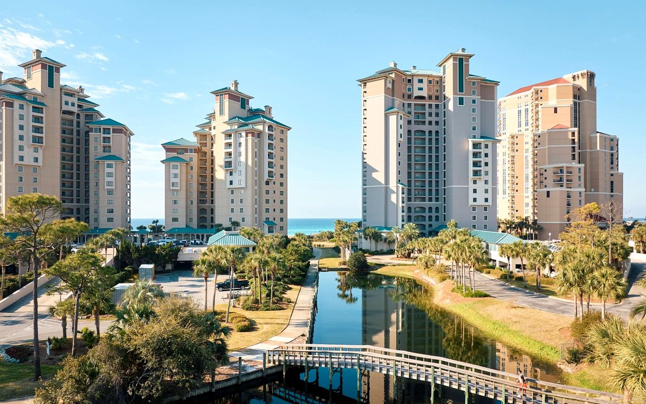
The details that make a home feel right (light, proportion, color, finish) are also the details that make it sell. We work with buyers and sellers across Sandestin, Miramar Beach, and the 30A corridor, and we know what resonates with buyers at every price point in this market.
When you're ready to talk about preparing your home or finding your next one, reach out to The Agency Northwest Florida Beaches. We're here to help you make the right moves.
When you're ready to talk about preparing your home or finding your next one, reach out to The Agency Northwest Florida Beaches. We're here to help you make the right moves.